
Configure donut chart widgets to visualize data distribution in your dashboard
The Donut Chart widget in NocoDB dashboards is a variant of the pie chart that features a hollow center, allowing for additional information or metrics to be displayed. It is particularly useful for showing how different segments contribute to a whole while providing space for supplementary details.
สั่งงานด้วย NocoAI
Add a donut chart of [deals] by [Stage]Add a donut chart of [records] by [Category]Change the [widget name] chart to show only [this quarter]
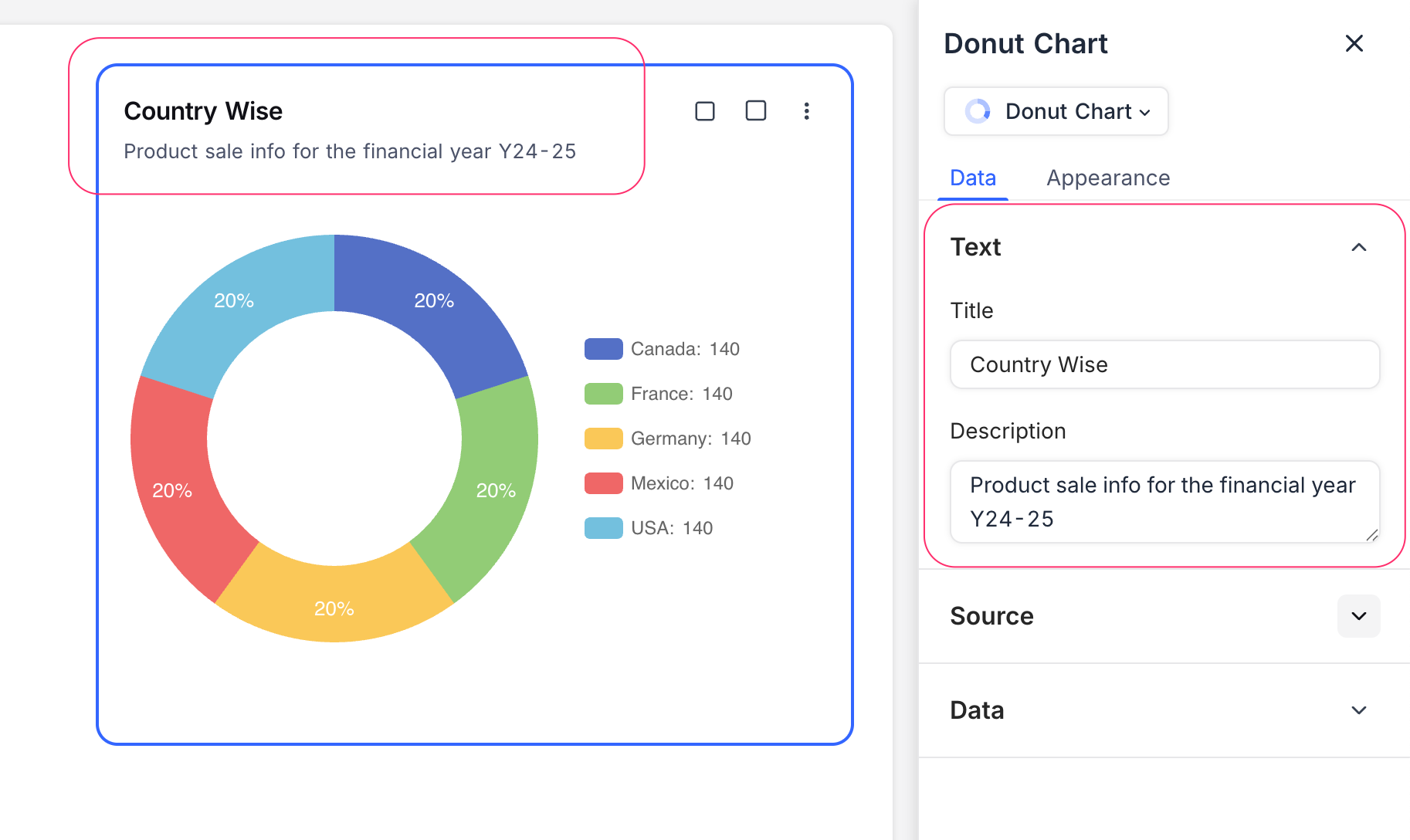
Title & Description
- Title : Enter a title for the donut chart widget. This will be displayed prominently at the top of the widget.
- Description : Optionally, add a description to provide context or details about the data being visualized. This will appear below the title.
Data Source
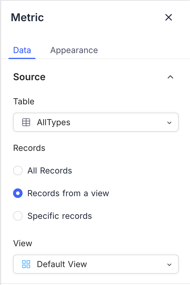
- Table : Select the table from which you want to pull data for the donut chart. This is the primary source of records for the visualization.
- Record : Select records from the chosen table to be included in the donut chart. You can choose from:
- All Records : Displays all records in the selected table.
- Records from a view : Allows you to filter records based on a specific view, enabling focused visualizations. You need to select a view from the dropdown.
- Specific Records : Apply filters to select specific records for the donut chart. This is useful for showing data based on certain criteria. You can add multiple filters to refine the selection.
<img src="/img/v2/dashboards/widget-number-source-2.png" alt="Number Widget Config 2" style={{ width: "30%", minWidth: "240px", borderRadius: "8px", border: "1px solid #ddd" }} />
Display
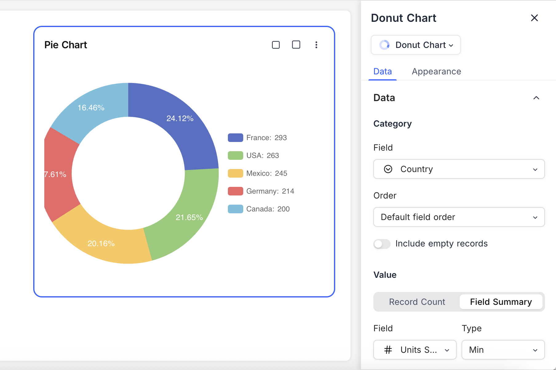
Category Field : Select the field that will be used to determine the segments of the donut chart. This field should contain categorical data that you want to visualize.
- Order : Choose how the segments are ordered in the donut chart. You can order them by:
- Default : Segments are displayed in the order they appear in the data.
- Ascending : Segments are sorted in ascending order based on their values.
- Descending : Segments are sorted in descending order based on their values.
- Include empty records : Optionally, you can choose to include records that do not have a value for the selected category field. This can help in visualizing segments that may otherwise be omitted due to missing data.
- Order : Choose how the segments are ordered in the donut chart. You can order them by:
Value Field : Choose the field that will determine the size of each segment in the donut chart. This field should contain numerical data that represents the value for each category.
- Record Count : Displays the count of records for each category.
- Field Summary : Shows the sum, average, minimum, maximum, or count of a specific field across the selected records. Available options vary based on the field type.
Appearance
You can customize the appearance of the donut chart to enhance its visual appeal and clarity. The following options are available:
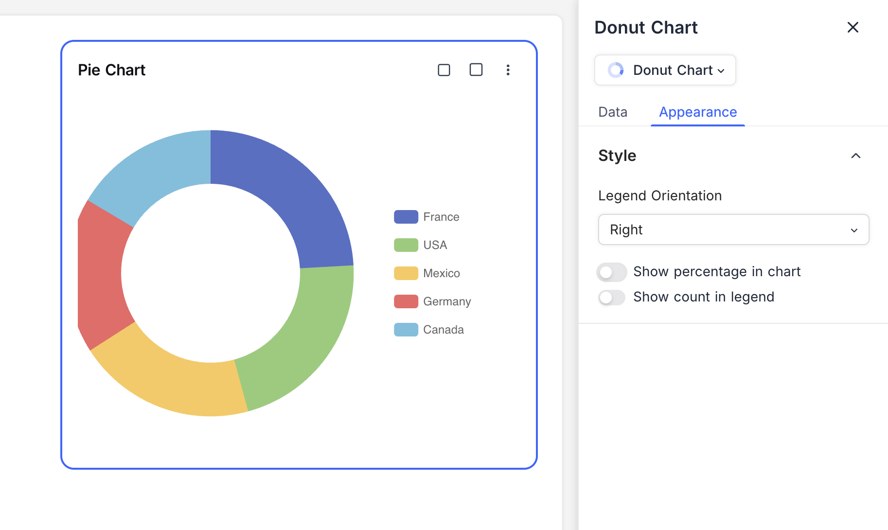
Size : Adjust the size of the donut chart to fit your dashboard layout. You can choose from small or medium sizes.
Legend Orientation : Choose the orientation of the legend that displays the category names and their corresponding colors. Options include:
- Right : Places the legend to the right of the donut chart.
- Bottom : Places the legend below the donut chart.
- Left : Places the legend to the left of the donut chart.
- Top : Places the legend above the donut chart.
Show Percentage in chart : Enable this option to display the percentage contribution of each segment within the donut chart. This provides additional context for understanding the data distribution.
Show Count in Legend : Enable this option to display the count of records for each category in the legend. This helps in understanding the number of records represented by each segment.
Related pages
- Number : Configure number widgets to display key metrics in your dashboard
- Text : Configure text widgets to add static textual content to your dashboard
- Bar Chart : Configure bar chart widgets to compare values across categories in your dashboard
- Line Chart : Configure line chart widgets to visualize trends and comparisons over time or categories in your dashboard
- Pie Chart : Configure pie chart widgets to visualize data distribution in your dashboard
- iFrame : Embed external content securely inside your dashboard using the iFrame widget