
Configure line chart widgets to visualize trends and comparisons over time or categories in your dashboard
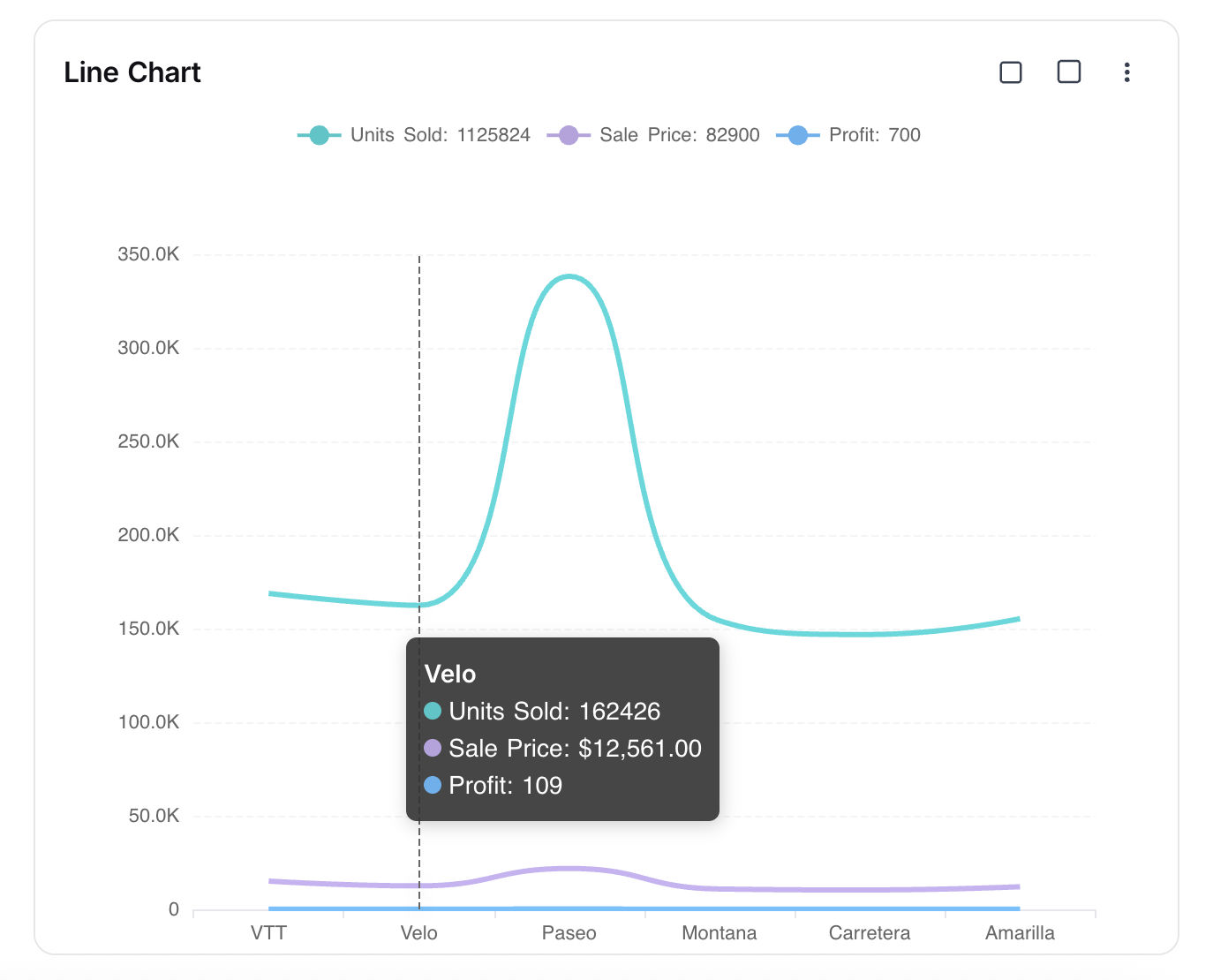
The Line Chart widget in NocoDB dashboards allows you to visualize trends and comparisons across categories or time. It is especially useful for tracking changes, identifying patterns, and comparing multiple metrics simultaneously.
สั่งงานด้วย NocoAI
Add a line chart of [new signups] per [week]Add a line chart of [revenue] by [month] for this yearChange the [widget name] chart to group by [day]
Title & Description
- Title : Enter a title for the line chart widget. This will be displayed prominently at the top of the widget.
- Description : Optionally, add a description to provide context or details about the data being visualized. This will appear below the title.
<img src="/img/v2/dashboards/widget-line-graph-title.png" alt="Line Chart Title" style={{ width: "50%" }} />
Data Source
- Table : Select the table from which you want to pull data for the line chart.
- Records : Choose which records to include:
- All Records : Displays all records from the selected table.
- Records from a view : Uses records from a specific view, allowing you to apply filters and sorts.
- Specific Records : Apply custom filters to select only certain records.
<img src="/img/v2/dashboards/widget-line-graph-source.png" alt="Line Chart Data Source" style={{ width: "50%" }} />
Display
X-axis
- Field : Select the field whose values will be shown along the X-axis (e.g., Date, Product, Category).
- Sort By : Choose how categories are sorted:
- xAxis Value : Sorts based on the label values.
- yAxis Value : Sorts based on the numeric values plotted.
- Order : Select Default, Ascending, or Descending.
- Include empty records : Optionally include categories that have no values.
- Include others : Toggle to group smaller categories into an “Others” bucket.
Y-axis
- Fields : Choose the field(s) to plot on the Y-axis. You can add multiple fields to display multiple lines in the chart.
- Record Count : Shows the number of records for each category.
- Field Summary : Displays the Sum, Average, Min, or Max of a numeric field.
- Start at zero : Ensures the Y-axis always begins at zero for consistency.
<img src="/img/v2/dashboards/widget-line-graph-axis.png" alt="Line Chart Axis Config" style={{ width: "50%" }} />
Appearance
Customize how the chart is displayed for clarity and readability:
- Size : Adjust the chart size (Small, Medium).
- Legend Orientation : Choose where to display the legend (Top, Bottom, Left, Right).
- Show count in legend : Enable to display record counts in the legend.
- Plot data points : Enable to highlight data points on the line.
- Smooth lines : Enable to display smoothed curves instead of jagged lines.
<img src="/img/v2/dashboards/widget-line-graph-style.png" alt="Line Chart Appearance" style={{ width: "50%" }} />
Related pages
- Number : Configure number widgets to display key metrics in your dashboard
- Text : Configure text widgets to add static textual content to your dashboard
- Bar Chart : Configure bar chart widgets to compare values across categories in your dashboard
- Pie Chart : Configure pie chart widgets to visualize data distribution in your dashboard
- Donut Chart : Configure donut chart widgets to visualize data distribution in your dashboard
- iFrame : Embed external content securely inside your dashboard using the iFrame widget